To design screen printed shirts that captivate your audience, you must start thinking in layers of solid color. This simple shift in mindset is the absolute key to creating artwork that not only looks incredible but is also affordable to produce. It’s the first step towards turning your creative vision into a tangible, high-quality product.
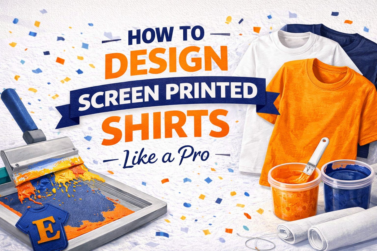
Build Your Foundation for a Flawless Screen Print
Before getting lost in trendy fonts or a dozen colors, let's nail down what makes screen printing so unique. This isn't like your office inkjet printer. At T-Shirt Envy, we physically push ink through a custom-made mesh screen onto the fabric, one color at a time. It’s this hands-on process that delivers those legendary, durable, and vibrant colors that pop right off the shirt.
There's a reason screen printing remains the undisputed king of custom apparel. The industry knows it—it’s on track to command a 46.0% market share by 2026. This isn't an accident. For larger orders, nothing beats its cost-efficiency, making it the go-to solution for businesses, creators, teams, and anyone who needs premium quality in bulk.
Vector vs. Raster: The Professional's Choice
When you're creating your artwork, it will fall into one of two camps: vector or raster. Understanding the difference is crucial for a smooth and fast production process.
-
Vector Art (.AI, .EPS, .PDF): This is the industry standard, period. Vector graphics are built with mathematical formulas, meaning you can scale them from a small chest logo to a massive full-back design without any loss of quality. They stay perfectly crisp and clean. Think logos, text, and bold illustrations.
-
Raster Art (.JPG, .PNG, .PSD): These are your pixel-based images, like a digital photograph. While great for photorealistic details, they have a major limitation: they get blurry and pixelated when you try to make them bigger. We can work with them, but they often need extra prep work and might not deliver the sharp, clean lines screen printing is famous for.
For the Quick, Quality, Printing!™ result we promise at T-Shirt Envy, starting with vector artwork is your best move. It ensures a seamless production process, from the file you send us to the final, professional-grade print. To see exactly how we turn these files into finished shirts, you can check out our guide on the screen printing process. Getting this right from the start makes all the difference.
Master Your Color Strategy for Screen Printing
When it comes to screen printing, color is everything—and it's also the biggest factor driving your final cost. Every single color in your artwork requires its own screen, a separate ink mix, and an extra pass on the press. This makes a six-color design worlds apart from a two-color job in both complexity and price.
This isn't just about saving money; it's about smart, impactful design. Embracing a limited color palette often pushes your creativity and results in a bolder, more memorable shirt. Think about how many iconic brands built their identity on just one or two colors—it's a testament to the power of simplicity.
Nailing Your Colors
So, how do you ensure the perfect shade of blue on your monitor is the same blue that ends up on your shirt? The industry standard is the Pantone Matching System (PMS).
This is the universal color language for printers. By giving us a specific PMS code, you're providing the exact formula to mix that ink. It removes all guesswork and guarantees your brand colors are perfectly consistent, every single time. When you upload your design through the TSE mobile app, our team can lock in your specified PMS colors, ensuring total brand consistency across your entire order.
Another key piece of the puzzle is the underbase. If you're printing light ink on a dark garment, we first lay down a layer of white ink. This acts as a primer, sealing off the dark fabric so your colors pop with the bright, clean vibrancy you intended.
This simple flow chart shows how we build a great design: start with solid shapes, confirm your art type, and then make deliberate color choices.

The takeaway is that color selection is the final, crucial piece that sits on top of a well-built foundation.
Pro Tip: We can create the illusion of more tones or even gradients using a classic technique called halftones. By printing tiny dots of a single ink color in varying sizes and spacing, we can create different shades. It's a clever trick that adds incredible depth to a design without adding to your screen count and cost.
Prepare a Flawless Print-Ready Digital File

A brilliant idea can fall flat with a poorly prepared file. Getting the technical side right is what separates an amateur design from a professional print. This is where you build the blueprint that ensures your artwork translates perfectly from screen to fabric, and it's essential for achieving fast turnaround times.
Think of your digital file as the foundation of your entire project. Starting with the right settings in a program like Adobe Illustrator is non-negotiable. Always set up your artboard to the final print dimensions at a high resolution—even when you’re working with vectors. This simple habit prevents countless headaches down the road.
It’s this commitment to quality that keeps screen printing at the forefront of the custom apparel world. The global custom t-shirt market, which hit USD 9.88 billion, is projected to soar to USD 14.61 billion by 2030, and screen printing’s scalability is a huge reason why.
Lock In Your Artwork
Once your design is finished, a few final checks will make or break your print. These small but crucial actions prevent major production delays and guarantee your vision is what ends up on the shirt.
The most common rookie mistake we see is forgetting to convert text to outlines. If you send us a file with live text and we don’t have that exact font, our software will substitute it with something else, instantly wrecking your design. Outlining your text turns it into a fixed vector shape that can’t be changed.
Critical Step: In Adobe Illustrator, just select your text, head to the "Type" menu, and hit "Create Outlines" (Shift+Ctrl+O). This locks in your typography for good, ensuring it prints exactly as you designed it.
Finally, saving your file correctly is the last piece of the puzzle. The best formats for screen printing are always vector-based:
-
.AI (Adobe Illustrator)
-
.EPS (Encapsulated PostScript)
-
.PDF (Portable Document Format)
These formats ensure every line, shape, and detail stays perfectly sharp. When you upload a clean file like this, your project is set up for a smooth run, helping us deliver that Quick, Quality, Printing!™ we’re known for.
To dig deeper into this topic, check out our guide on how to design prints for t-shirts for even more professional tips.
Get Your Sizing, Placement, and Fabric Right

You can have the most brilliant artwork in the world, but if it’s sized incorrectly or placed in an awkward spot, the entire shirt is a flop. When you design screen printed shirts, where the art goes and what it’s printed on are just as crucial as the design itself.
Think about placement from the very beginning. Sure, full front and left chest are classics for a reason, but don’t let that limit your creativity. A clean sleeve print, a bold design across the back yoke, or even a unique wrap-around graphic can make your apparel pop. It's this kind of personalization that’s driving the custom printing market, which is expected to hit a staggering USD 17.22 billion by 2034. You can see the full market forecast here to get a sense of the demand.
Match Your Design to the Fabric
The material you choose has a huge impact on the final look and feel of your print. Screen printing ink behaves differently on every fabric, so your choice here really defines the end result. As an industry leader, T-Shirt Envy ensures your design is optimized for the garment you select.
Here's what you need to know about the most common options:
-
100% Cotton: This is the gold standard for screen printing. Cotton fibers grab ink perfectly, giving you vibrant, crisp, and solid colors. It’s the best canvas for graphics that need to be bold and punchy.
-
50/50 Blends (Cotton/Polyester): A great middle-ground offering softness and durability. Prints on 50/50s tend to have a softer, slightly more "vintage" feel because the ink doesn’t fully saturate the polyester fibers.
-
Tri-Blends (Cotton/Polyester/Rayon): Famous for their incredibly soft feel and stylish drape, tri-blends create a distinct, fashionable heathered look. They’re the go-to for achieving a retail-quality, worn-in vibe right from the first wear.
A single design file rarely works for all shirt sizes. A graphic that looks perfect on a size Small will look comically small on a 3XL. We always recommend creating at least two versions of your artwork—one for smaller garments and one for larger ones—to keep your design looking great across the entire size run.
For a complete breakdown of standard print dimensions and how to scale your art, check out our guide on t-shirt design sizes.
Your Final Pre-Press Checklist to Avoid Common Pitfalls

Alright, before you hit “submit,” let’s do one last check. A few minutes here can be the difference between a flawless run and a frustrating phone call. This is how we ensure your project gets the Quick, Quality, Printing!™ treatment T-Shirt Envy is known for.
Think of this as your final line of defense against those small, easy-to-miss mistakes that can cause major delays. We see these every day, and catching them now saves everyone time and money, reinforcing our commitment to reliability and customer satisfaction.
The Non-Negotiable Final Check
Before you upload your file on our website or through the TSE mobile app, give your design a quick once-over for these common culprits.
-
Are all fonts outlined? This is, without a doubt, the #1 issue we run into. If your text isn't converted to shapes (or "outlined"), our systems might substitute a default font, and your design won't print as you intended.
-
Is your thinnest line thick enough? Ink has a physical presence and needs a certain amount of surface area to stick. To prevent spotty or broken lines, we recommend keeping all design elements at least 1 point (pt) thick.
-
Did you proofread everything? You'd be surprised how easy it is to miss a simple typo. That killer tagline isn't so killer with a spelling mistake. Read it forward, read it backward, and then have a fresh set of eyes look it over.
-
Is the artwork high-resolution? A fuzzy, pixelated JPEG will give you a fuzzy, pixelated print. No way around it. Always start with a high-quality vector file or a raster image that is at least 300 DPI at the final print size.
-
Is your color count realistic? Remember, every color in a screen print design requires its own screen and setup, which adds to the cost. If you're working with a specific budget, make sure you haven't accidentally added an extra color or two.
When to Choose a Different Method: Screen printing is the undefeated champ for bold, graphic designs, especially in larger quantities. But if your artwork is a full-color photograph and you only need a handful of shirts, our DTG (Direct-to-Garment) printing service is a much better fit. It’s built for complex, multi-color images on small runs and delivers incredible detail without the screen setup fees. Knowing the right tool for the job is half the battle.
Frequently Asked Questions About Screen Print Design
After printing thousands of shirts for small businesses, corporate events, and creators, we've heard just about every question in the book. We’ve seen what works, what doesn't, and what trips people up the most.
To save you some time and empower your next project, here are the answers to the questions we get asked most often.
What Is the Minimum Line Thickness for Screen Printing?
Stick to a minimum line thickness of 1 point (pt). It’s a hard-and-fast rule we live by to ensure high-quality custom printing.
Any thinner, and you run a serious risk of the ink not pushing through the screen mesh correctly. The result? Broken lines, lost details, and a design that just doesn’t look sharp. Keeping your lines at 1 pt or thicker ensures your artwork holds up during production and on the final garment.
How Do I Choose the Right Pantone Colors for My Design?
The only way to guarantee perfect color is to use a physical Pantone Coated swatch book. Screens lie—what you see on your monitor is almost never what you get in real life because of varying calibrations.
When you're in Adobe Illustrator or your design program of choice, make sure you're using the Pantone Solid Coated library. Give us those codes, and we can mix our inks to match them perfectly.
Providing us with Pantone codes is the single best way to guarantee color accuracy for your brand. It takes all the guesswork out of the process, ensuring consistent results every time you order—a must for corporate and bulk orders.
Can I Use a Photograph for a Screen Printed Shirt?
Absolutely, but it’s not a simple process. Printing photos requires a special technique called simulated process printing. We use a series of halftones—tiny dots of ink—in a select range of colors to recreate the look and feel of the original photograph.
This method is more complex and has higher setup costs than standard printing. Because of that, it really only makes sense for larger orders where those initial costs are spread out over many shirts. For small runs with photos, DTG printing is the more practical, cost-effective choice.
Why Do You Ask for My Text to Be Outlined?
This is one of the most critical steps in file prep. Outlining your text (or converting it to paths) essentially turns your letters into permanent vector shapes.
If you send us a file with "live" text and we don't have that exact font on our computers, our software will automatically swap it for a default font. Your carefully chosen typography gets completely ruined. Outlining your text locks it in forever, guaranteeing it prints exactly how you designed it.
Ready to bring your vision to life? Download the TSE mobile app and create your design in minutes, or start your custom order today


