You've probably got the same problem most first-time hat buyers run into. The idea in your head looks sharp, but once you start thinking about cap styles, logo size, puff embroidery, stitch limits, and placement, the project suddenly feels more technical than creative.
That's why strong embroidery hat ideas need two things at once. They need style, and they need a realistic production plan. A great hat isn't just a cool sketch. It's the right design on the right hat, stitched in a way that stays clean, readable, and durable after real wear.
Turn Your Vision into Wearable Art
A custom hat can do a lot of work for you. It can act as a uniform piece, event merch, fundraiser gear, creator merch, or a branded giveaway that people keep wearing. Embroidery remains the premium choice because it adds texture, durability, and a finished look that printing on hats often can't match.

The biggest mistake happens before the machine even starts. According to hat embroidery sizing guidance from Aesthetic BK, 70% of custom apparel forum users cite mis-sized designs as the top reason for project failure, which contributes to 20-30% remake rates for rush orders. The same source notes that getting sizing right can boost perceived quality by 40%.
That tracks with what works in production. Most bad hats don't fail because the idea was weak. They fail because the design was too detailed for the cap, too small to read, or placed on a panel that bends and shifts when worn.
Start with the message, not the machine
Before choosing thread colors or a stitch style, answer one simple question. What should the hat communicate at a glance?
If the answer is brand recognition, the design should lean bold and simple. If it's a personal keepsake, a monogram or small phrase may be enough. If it's event merch, the hat has to balance style with instant readability from a few feet away.
Practical rule: The best embroidery hat ideas usually get simpler as they get better.
What polished projects usually have in common
Strong hat projects tend to share a few traits:
- Clear focal point: One logo, word, icon, or patch leads the design.
- Intentional placement: Front-center feels classic, side placement feels more fashion-driven, and back placement works best as a secondary detail.
- Hat-design match: Structured hats support detail better, while softer hats reward restraint.
- Contrast that reads fast: Thread and hat color need separation, especially outdoors and in photos.
That's where the project gets easier. Once the design idea matches the shape and structure of the hat, the technical choices stop feeling like limitations. They start acting like guardrails that protect the final result.
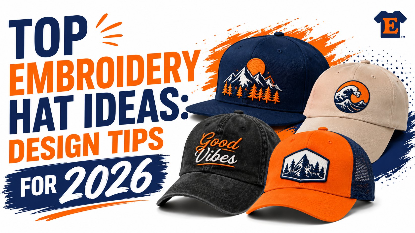
Creative Embroidery Concepts That Get Noticed
A hat gets noticed for one reason first. The idea reads fast, and the production method supports it.

The strongest concepts usually fall into a few repeatable categories, but the creative choice only works if it matches what embroidery can reliably hold on a cap. That connection matters. A design that looks sharp in a mockup can lose impact fast if the stitch type, placement, or hat profile are working against it. If you are planning a custom embroidered hat project, start by choosing an idea that still looks good after it is simplified for thread.
Bold logos and branding
Front-facing logos are still the safest option for businesses, teams, schools, gyms, and events because they do one job clearly. They identify the group and stay visible in motion, in photos, and across a room.
Good logo embroidery depends on restraint. Thin outlines, tiny taglines, distressed textures, and tightly stacked lettering often break down on a curved front panel. Clean shapes and a limited color count usually produce the better hat, even if the original logo has more going on.
These concepts tend to translate well:
- Coffee shops and restaurants: icon, crest, initials, or a simplified badge
- Contractors and service brands: bold text mark with strong contrast
- Fitness brands: abbreviated logo, block lettering, or a design built for puff embroidery
A client may ask to fit the full brand system onto the front of a cap. That is usually the wrong move. Hats reward editing.
Minimalist monograms and text
Small, understated embroidery can look more premium than a large front design, especially on softer caps. One initial, a two-letter monogram, a short phrase, or a clean wordmark often feels intentional rather than promotional.
This style works best when the hat itself carries part of the personality. Washed cotton, garment-dyed finishes, and unstructured profiles pair well with subtle stitching because the whole product reads relaxed and personal. That is why this category performs well for bridal parties, boutique merch, creator drops, and gift items.
Small text works best when the font is clean, the spacing is open, and the phrase stays short.
If the phrase needs more than a quick glance to understand, it is too long for most hats. Shirts and tote bags handle long copy better.
Custom patches and appliqué
Patches change the look immediately. Instead of stitching directly into the cap as the only visual layer, they add edge definition, texture, and a more product-driven feel.
This option fits vintage branding, outdoor programs, clubs, motorsports, breweries, destination merch, and heritage-style artwork. It also solves a practical problem. Artwork with fine internal detail or shape-heavy borders can sometimes reproduce more cleanly as a patch than as direct embroidery on the front panel.
The trade-off is style consistency. A patch can feel substantial and collectible, but it is not right for every brand. Clean modern branding often looks better with direct embroidery unless the rest of the collection supports a patch-based look.
Thematic and pop culture designs
Symbol-driven hats tend to outperform complicated illustrations. A mascot, hobby icon, seasonal graphic, city abbreviation, or niche reference gives the wearer something recognizable without overcrowding the cap.
These designs work best for event merch, community groups, creators, and specialty brands because they create affiliation first. The wearer does not need a full logo to understand the message. They only need a clear symbol that the right audience will recognize immediately.
The practical limit is clutter. One motif in one placement usually beats a cap covered with references. If the design needs multiple elements to make sense, it probably belongs on a larger print surface instead of a hat.
Choosing the Right Hat Style for Your Design
A good design can still fail on the wrong cap. The hat's structure is the first production decision that matters. Maggie Frame Store's hat logo size guidance makes the point clearly: structured caps with stiff front panels can support detailed, multi-color designs up to 2.25" high, while unstructured hats need simpler, minimalist designs to avoid distortion when worn.

If you're comparing options for a custom embroidered hat order, start by matching the hat shape to the design complexity, not just to current style trends.
What each hat style does best
Some hats behave like a stable canvas. Others shift, fold, and wrap around the wearer's head. That changes how clean the stitching looks.
| Hat Style | Best For Designs That Are… | Max Front Embroidery Area (Approx.) |
|---|---|---|
| Snapback | detailed, bold, multi-color | up to 2.25" high |
| Trucker hat | prominent, simple, high-visibility | about 3" x 3" |
| Dad hat | minimal, vintage, text-first | smaller and simpler front layouts |
| Beanie | short text, patches, small icons | crown or folded cuff area |
| Bucket hat | simple motifs, centered or wrap-style concepts | varies by panel and placement |
Structured caps and snapbacks
These are the safest choice for logos that need clarity. The front panel stays flatter under the needle, which gives the embroidery machine a more predictable surface. That matters when you want cleaner edges, multiple colors, and more design density.
If a client brings a business logo with several elements, this is usually where I'd start. It gives the art the best chance to survive translation into thread.
Dad hats, beanies, and softer shapes
These hats look relaxed because they are relaxed. That softness is part of their appeal, but it also means the embroidery can warp visually once the hat is on someone's head.
That doesn't mean they're bad for embroidery. It means they reward restraint.
Use them for:
- Short words or initials
- Small icons
- Simple flat embroidery
- Patch applications when the style supports it
Put a complex logo on a soft hat and the wearer's head becomes part of your distortion problem.
Trucker hats and bucket hats
Trucker hats offer strong front visibility, especially for bold marks. Their front panels often handle simpler logos and larger motifs well, while the mesh back keeps the style casual and breathable.
Bucket hats are a different beast. They can look excellent with centered motifs or fashion-driven embroidery, but they're not ideal for every corporate logo. If the artwork depends on rigid alignment, a bucket hat often isn't the easiest home for it.
The right call is usually simple. If your design needs precision, choose structure. If your design needs vibe, choose the silhouette that sells the mood.
Key Technical Constraints for Flawless Hat Embroidery
Good concepts become production-ready through this process. Embroidery doesn't read artwork the way a screen does. It reads a stitch path. Every curve, fill, border, and letter has to be translated into a sequence the machine can sew on a curved surface.

For hat work, the constraints are not optional. HoopTalent's hat embroidery guide states that flat embroidery needs a minimum line thickness of 0.05 inches, while 3D puff embroidery needs at least 0.2 inches. The same guide notes that most hat designs should stay under 15,000 stitches and use 6 or fewer thread colors to avoid bulk and tension problems on the cap's curved surface.
If you want a deeper read on material behavior before picking garments, this guide to the best fabrics to embroider on is useful context.
Flat embroidery versus 3D puff
Flat embroidery is the all-around workhorse. It handles logos, text, mascots, and small icons better than puff because it can carry more detail with less bulk.
3D puff works when the art is bold enough to deserve height. Think block letters, chunky initials, and simple emblem shapes. It does not work for thin script, tiny outlines, or intricate logos. Foam needs room under the stitching. If the lines are too thin, the result gets messy fast.
A practical way to approach this:
- Flat embroidery fits detail and control
- 3D puff fits impact and simplicity
Why stitch count and color count matter
A hat isn't a sweatshirt chest. You're stitching on a small, curved area that already has seams, crown shape, and tension changes. Packing too many stitches into that space makes the design bulky and unstable.
Too many thread colors can also work against the result. Every color change adds production complexity, and on a hat, complexity isn't always your friend. Strong contrast with fewer colors usually looks cleaner than a rainbow logo forced into a small front panel.
Digitizing is where most quality decisions happen
Digitizing turns artwork into embroidery instructions. Professionals use this stage to decide stitch direction, density, underlay, compensation, and sequencing.
Shop-floor reality: A beautiful file can still become a bad hat if it wasn't digitized for hats specifically.
That's why the same logo may need a different embroidery setup for a snapback than for a beanie. The artwork may be identical, but the cap shape changes how the stitches behave. Good digitizing accounts for that before the first sample gets sewn.
Ordering Your Custom Hats with T-Shirt Envy
A hat order usually feels simple until the artwork hits production. The logo looked clean on screen, the mockup looked approved, and then the first sample shows the actual problems. Text closes up, the front panel pulls, or the design sits too high on the crown. Good ordering process prevents that.
At T-Shirt Envy, the best results start before the invoice is paid. Clear art, the right hat choice, and early production decisions save time because hat embroidery has less room for correction than a flat print on a tee. A curved surface, center seam, crown structure, and stitch limits all affect the outcome.
What to prepare before you order
Come in with the clearest version of your artwork you have. Vector files are best, but a sharp PNG or PDF can still work if the embroidery team needs to rebuild the art for stitching.
Have these details ready:
- Hat style: snapback, trucker, dad hat, beanie, or bucket hat
- Placement: front, side, back, or patch
- Embroidery method: flat embroidery or 3D puff, if the artwork is simple enough
- Quantity and deadline: especially for launches, staff uniforms, schools, or events
If the file is not ready for production, professional embroidery design digitization services help convert the artwork into a stitch file that is built for hats, not just adapted from a general logo.
Why the workflow matters on rush orders
Rush jobs go wrong for predictable reasons. Approval comes in late. Artwork changes after digitizing. The customer chooses a soft cap for a design that needed a firmer front panel. None of that is unusual, but all of it slows production.
A better workflow confirms the production-sensitive choices first. That means cap style, decoration method, size, thread colors, and placement all get approved before the job moves forward. It is faster to fix a proof than to restitch a run of hats that never had a fair chance.
The TSE mobile app also helps at this stage. Customers can upload files, review order details, and track production without relying on scattered emails or text threads.
What good service looks like here
A reliable embroidery partner should do more than accept artwork and press start. They should catch the problems a first-time buyer would miss.
If a logo is too thin for puff, they should say so. If the design is too tall for the usable front area, they should resize it or suggest a patch. If small text is heading onto an unstructured dad hat, they should explain the trade-off clearly so you can choose between softness and legibility.
That is what “Quick, Quality, Printing!™” should mean in practice. Fast turnaround matters, but only if the hat still looks right when it comes out of the box.
For brands, schools, creators, and event teams, that matters more than the order form itself. The hat becomes public-facing branding the moment someone puts it on.
Start Creating Your Signature Headwear Today
The difference between average hats and memorable ones usually comes down to three decisions. Choose the right concept, put it on the right hat, and respect the limits of embroidery as a craft.
That's why the best embroidery hat ideas aren't the most complicated ones. They're the ones that survive contact with the everyday world. A clean logo on a structured cap, a subtle monogram on a dad hat, a patch for a heritage look, or a bold puff wordmark on the right silhouette can all work beautifully when the design matches the canvas.
If your project has to do a job, keep that job in focus. Staff hats need clarity. Event merch needs instant appeal. Creator merch needs identity. Fundraiser hats need enough style that people want to wear them after the event is over.
The practical path is simple:
- Start with one strong idea
- Match it to the right hat style
- Simplify before production forces you to
- Use expert digitizing so the stitch file supports the design
That approach saves time, reduces revisions, and gives you a finished product that feels intentional.
Frequently Asked Questions About Hat Embroidery
What file type should I send for custom hat embroidery
Send the cleanest artwork you have. Vector files are usually best for logos, but high-resolution artwork also helps if the design needs to be rebuilt or digitized for embroidery.
Can I bring my own hats or apparel
Yes, many custom apparel shops can work with customer-supplied items. It's smart to confirm the hat brand, panel structure, and fabric first, because not every blank is equally good for embroidery.
How do I know if my design is too detailed
If the logo relies on very thin lines, tiny lettering, or layered detail, it may need to be simplified. Hat embroidery has tighter limits than chest embroidery on shirts or jackets, especially on soft or curved surfaces.
Is 3D puff better than flat embroidery
Not automatically. Puff is better for bold shapes and simple lettering. Flat embroidery is usually better for detailed logos, small icons, and designs that need cleaner definition.
What helps a rush order go smoothly
Approve the hat style, placement, and artwork as early as possible. Rush jobs go better when the design has already been sized correctly and digitized for the specific cap you're ordering.
If you're ready to turn strong embroidery hat ideas into finished headwear that looks polished and wears well, start your next project with T-Shirt Envy. Upload your artwork, use the TSE mobile app to manage your order, and get the support you need for branded merch, team hats, event gear, or one-off custom pieces. Start your custom order today and experience Quick, Quality, Printing!™


