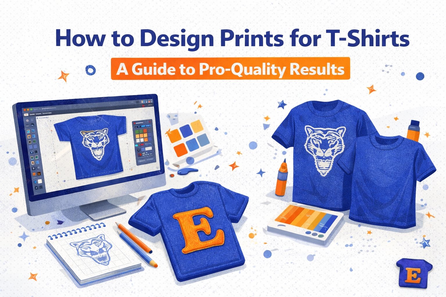
Every head-turning t-shirt starts with a killer concept. Learning how to design prints for t-shirts is all about blending your creative vision with a real understanding of who you're designing for and the shirt itself. It's a process of brainstorming ideas that connect, defining a message that hits home, and treating the garment as your canvas.
From Great Idea to Wearable Art
Turning a flash of inspiration into a design people actually want to wear is where the magic happens. Whether you’re creating merch for a business, gear for a corporate event, or just a personal statement piece, the real work starts long before you open up Adobe Illustrator or Canva. It begins with purpose.
First, you have to nail down who you're designing for and why. Building a brand identity for a local coffee shop? You’ll probably want to lean into cozy, minimalist aesthetics. Gearing up for a tech conference? A clean, modern logo on a premium fabric sends a professional and polished message. And for a family reunion, it’s all about fun and nostalgia.
The most successful t-shirt designs always communicate a specific message to a specific audience. Don't design in a vacuum—always picture the person who will wear your shirt and what you want them to feel.
Thinking Beyond the Graphic
A classic mistake is designing a graphic in isolation, without thinking about the t-shirt it's going on. The fabric color, the material blend, and even the fit aren't just details to figure out later; they are fundamental parts of your design canvas.
A complex, multi-color design that looks incredible on a white background might turn into a muddy mess on a heather gray shirt. A bold, simple graphic could look stunning on a black tee but feel way too stark on a pastel color.
This kind of strategic thinking is more critical than ever. The global custom t-shirt printing market is on fire, valued at $4.9 billion in 2024 and projected to rocket to $9 billion by 2033. To cut through the noise, your designs need to be sharp and impactful. In fact, data shows prints with vibrant colors and crisp edges can boost sales by up to 30%, and a massive 70% of top-selling custom tees feature minimalist yet bold motifs. For a deeper dive, you can explore the latest t-shirt market statistics to see how these trends can work for you.
Before we move on, let's quickly summarize the core principles that guide great t-shirt design. These are the foundational concepts we apply to every project to make sure the final product doesn't just look good on a screen, but looks fantastic on a person.
Core Design Principles for T-Shirt Prints
| Design Principle | Why It Matters for T-Shirts | Pro Tip |
|---|---|---|
| Simplicity | A clean, uncluttered design is easier to print, more memorable, and often more stylish. It’s legible from a distance. | Remove any element that doesn't serve a purpose. Ask yourself: "Does this add to the message or just create noise?" |
| Contrast | High contrast between the ink and shirt color ensures your design pops. Low contrast can make the graphic look faded or unreadable. | Test your design on different fabric colors. A black graphic on a white tee is a classic for a reason—it just works. |
| Balance | A well-balanced design feels stable and visually pleasing. Asymmetrical balance can create energy, while symmetrical feels more formal. | Think about where the design will sit on the body. A centered, balanced graphic is usually a safe and effective bet. |
| Originality | In a sea of custom tees, a unique concept stands out. It reflects your brand's personality and connects with your audience. | Instead of using generic clipart, try hand-drawing elements or combining familiar concepts in a new way. |
Thinking through these principles early on will save you a ton of headaches later in the process and give your design a much stronger foundation for success.
Brainstorming and Finding Inspiration
With your audience and canvas locked in, it’s finally time to brainstorm. Inspiration is everywhere if you know where to look:
Current Trends: What styles, fonts, or color palettes are popular in your specific niche?
Your Brand's Story: What core values or key messages define your business, event, or cause?
Visual Platforms: Spend some time browsing sites like Pinterest and Behance for interesting color combinations and layout ideas.
The key is not to just copy what you see. Use these ideas as a jumping-off point to create something that is uniquely yours and speaks in your authentic voice. This blend of strategic thinking and creative execution is the philosophy we live and breathe here at TShirtEnvy, ensuring every single project is set up for success from day one.
Matching Your Design to the Right Print Method
A mind-blowing design can fall completely flat if it’s paired with the wrong printing technology. As industry leaders, we’ve seen it happen. That's why understanding how a design gets onto the fabric is just as important as the design itself.
Let's walk through the main players—Direct to Garment (DTG), Direct to Film (DTF), screen printing, and embroidery. Choosing the right one from the get-go saves you headaches, avoids costly reprints, and makes sure your vision translates perfectly from screen to fabric.
For Vibrant Full-Color and Photorealistic Designs
If your design is a full-color masterpiece—think a detailed painting, a high-resolution photo, or a graphic with tons of color gradients—then Direct to Garment (DTG) is your new best friend. DTG printers work a lot like your inkjet printer at home, applying water-based inks directly onto the t-shirt.
This method gives you an unlimited color palette and picks up incredible detail. It’s ideal for one-off prints or small batches where creative complexity is the whole point. For instance, an artist selling limited-edition prints of their digital art will get stunning, true-to-design results with DTG.
But to make DTG work its magic, you need to set up your file correctly:
File Type: High-resolution raster files, like PNGs, are perfect.
Resolution: A minimum of 300 DPI (dots per inch) is absolutely non-negotiable. Anything less, and you’re looking at a blurry, pixelated print.
Background: Always, always submit your design with a transparent background. This ensures only your graphic gets printed, not a big white box around it.
At TShirtEnvy, we’ve used DTG to bring incredible ideas to life, from complex illustrations for a startup's merch to photorealistic pet portraits for a birthday gift. The key is always giving the printer a high-quality file to start with.
For Bold Graphics and Large Orders
Planning a huge order with a bold, 1- or 2-color logo? Screen printing is the undisputed, most cost-effective champion for bulk jobs. It’s a classic for a reason. This method involves pushing ink through a mesh screen—basically a stencil—onto the fabric. Each color in your design requires its own separate screen.
That setup process is exactly why screen printing gets cheaper as your order size goes up; the initial cost is spread across more shirts. It’s perfect for:
Corporate events that need 500 shirts with the company logo.
School sports teams ordering uniforms.
Bands producing merchandise with an iconic, consistent design.
For screen printing, your design has to be a vector file (like an AI or EPS). Unlike pixel-based raster files, vectors are made of mathematical paths, so they can be scaled to any size without losing a bit of quality. Your design also needs color separation, where each color is isolated onto its own layer in the file.
Pro Tip: Screen printing absolutely excels with solid, bold colors. Avoid complex gradients and photorealistic images—they just don't translate well with this method and are much better suited for DTG or DTF.
The Versatile Hero for Tricky Fabrics
So, what if you want a vibrant, full-color design on a fabric that DTG struggles with, like polyester or a dark-colored nylon jacket? This is where Direct to Film (DTF) printing shines. DTF is a total game-changer, blending the full-color freedom of DTG with the ability to stick to a much wider range of materials.
The process is pretty cool: we print your design onto a special transfer film, which is then heat-pressed onto the garment. This creates a print that sits right on top of the fabric, giving you incredibly vibrant colors and a smooth, slightly plastic-like feel. It's a fantastic choice for athletic wear, work uniforms on synthetic blends, or any item where you need a full-color design to really pop on a non-cotton surface.
Here’s a quick visual flow to help guide your choice. It shows how your audience, message, and the shirt itself all point toward the ideal printing technique.

The real takeaway here is that your design and your product are inseparable. Your creative choices directly influence which printing method delivers the best results, and vice versa.
For a Premium, Textured Look
Finally, we have embroidery. This isn't printing at all, but a stitching process that adds a high-end, textured, and incredibly durable design to apparel. It’s the go-to for professional branding on items like polo shirts, hats, and jackets.
Designing for embroidery requires a completely different mindset. You need to think in terms of stitch counts and thread colors, not pixels or vectors.
Simplify: Complex details and tiny text get lost in the thread. Bold, simple shapes and clear lettering always work best.
Vector is King: Start with a clean vector file. This is what our digitizers use to map out the entire stitch pattern.
Think Big: Lines need to be thick enough to be rendered properly in thread. Tiny text is often the first thing to become unreadable.
An embroidered left-chest logo on a corporate polo shirt just screams professionalism and quality. It’s a powerful choice when you want your brand to feel established and high-end. To learn more about how these methods compare for specific projects, check out our guide on choosing the right print method. It’s a great resource for seeing these principles in action.
Ultimately, the path to a great t-shirt is about matching your creative ambition with the right production reality. Whether it’s the full-color freedom of DTG, the bulk efficiency of screen printing, the fabric versatility of DTF, or the premium touch of embroidery, making an informed choice is the foundation of Quick, Quality, Printing!™.
Mastering the Technical Side of T-Shirt Design
A brilliant concept is just the start. This is where we get into the nitty-gritty—the technical details that turn a good idea into a professional, print-ready file. Getting this right is how you truly master how to design prints for t-shirts and ensure your vision looks as good on fabric as it does on your screen.
These aren't just arbitrary rules; they're the foundation of a flawless print. A low-resolution file becomes a blurry mess, the wrong color mode creates dull, disappointing shades, and a missing transparent background can ruin an entire batch of shirts. Let's get these details dialed in.
Why 300 DPI Is Your Golden Rule
In the print world, you'll hear "300 DPI" thrown around a lot, and for good reason. DPI, or "Dots Per Inch," is all about the pixel density of your digital file. An image at 72 DPI might look sharp on your monitor, but it will print looking pixelated and fuzzy on a t-shirt.
For Direct to Garment (DTG) and Direct to Film (DTF) printing, 300 DPI is the non-negotiable industry standard. This ensures every line is crisp and every detail you obsessed over shows up perfectly on the final garment. Always set your canvas to 300 DPI before you even start designing. Trust me, it saves a world of headaches later.
Choosing the Right File Format
The file format you save your design in depends heavily on what your design looks like and how it will be printed. Submitting the wrong file type can cause printing errors or get your artwork flat-out rejected.
PNG for DTG/DTF: If your design is complex, has multiple colors, or features gradients and photographic elements, a PNG (Portable Network Graphics) file is your best friend. Its superpower is supporting transparent backgrounds, which is absolutely essential for making sure only your design gets printed—not a clunky white box around it.
AI/EPS/SVG for Screen Printing: For bold, simple graphics meant for screen printing, you need a vector file. Formats like AI (Adobe Illustrator), EPS, or SVG are built with mathematical paths instead of pixels. This means they can be scaled to any size, from a small chest logo to a huge back print, without losing an ounce of quality.
Pro Tip: Never just save a low-quality JPG as a PNG and call it a day. The original pixelation will still be there, hiding underneath. Your artwork needs to be created at the right resolution and size from the very beginning.
To make things easier, here's a quick cheat sheet comparing the file specs for the most common print methods. It’s a great reference to keep handy.
Print-Ready File Specification Cheat Sheet
| Specification | DTG/DTF | Screen Printing | Embroidery |
|---|---|---|---|
| Best File Format | PNG, TIFF | AI, EPS, SVG (Vector) | DST, EMB |
| Ideal Resolution | 300 DPI | Vector (resolution independent) | N/A (Digitized) |
| Color Mode | RGB | Pantone (PMS) or CMYK | Thread Color Codes |
| Background | Transparent | Transparent | Not Applicable |
| Key Detail | Raster (pixel-based) artwork | Clean lines, no tiny details | Minimum text height & line thickness |
This table should give you a solid starting point for prepping your files, no matter which printing path you choose.
Understanding Color Modes for Printing
The vibrant colors you see on your backlit screen don't always translate directly to ink on fabric. This is where understanding color modes—RGB vs. CMYK vs. Pantone—becomes absolutely critical.
RGB (Red, Green, Blue) is the language of digital screens. It’s an "additive" model where light is mixed to create a huge range of bright colors. For DTG printing, submitting an RGB file is often preferred because modern printers have advanced software (called a RIP) that expertly converts those screen colors to ink with impressive accuracy.
On the other hand, CMYK (Cyan, Magenta, Yellow, Black) is a "subtractive" model used for paper printing. Some print shops may request it, but it can sometimes look a bit dull on cotton compared to a well-managed RGB workflow.
Pantone (PMS) is a standardized color-matching system used almost exclusively in screen printing. With Pantone, you choose specific, pre-mixed ink colors from a swatch book. This is the only way to guarantee your brand's "TShirtEnvy Orange" looks identical on every single shirt, no matter when or where it’s printed.
As printing technology advances, hybrid workflows are becoming more common. Recent data shows that these new methods are cutting lead times by as much as 40% for US printers since 2023 and have boosted profitability for 65% of print shops. Designing with flexibility in mind is a smart move. You can learn more about how innovative print workflows are shaping the industry and stay ahead of the curve.
Essential File Prep Checklist
Before you even think about hitting "export," run through this final checklist. It will save you time, money, and a whole lot of frustration.
Outline Your Fonts: Always, always convert your text to outlines or shapes. If you don't, and the printer doesn't have the exact font you used, their system will swap it for a default one, completely wrecking your design.
Ensure a Transparent Background: Unless a solid background is an intentional part of your design, make sure it’s transparent. This is non-negotiable for DTG and DTF, where you want the graphic to blend seamlessly with the shirt's fabric.
Check Your Dimensions: Design your file at the exact physical size you want it printed. If you want a 12-inch wide graphic, your artboard should be 12 inches wide at 300 DPI. Don't guess.
With the TSE mobile app, uploading your perfectly prepped files is a breeze. For a quick-reference guide on our specific technical needs, check out our detailed artwork submission guidelines—it breaks down everything you need to know.
Getting Your Size and Placement Just Right

A killer design can fall flat if it's sized wrong or sits awkwardly on the shirt. This is where so many projects miss the mark. Learning how to design prints for t shirts that look truly professional means mastering layout. It’s what separates cheap-looking merch from apparel people can't wait to wear.
We’re not just talking about slapping a logo on the front. We’re diving into the details. A graphic that looks perfectly balanced on a size Small can shrink to a tiny, lonely square on a 3XL. Getting this right is how you turn a good concept into an amazing final product.
For small businesses, this is all about brand consistency. Our reliability is built on delivering that precision every single time, making your brand look sharp on every garment, in every order.
Standard Placement Rules of Thumb
While there’s always room to get creative, you don’t have to reinvent the wheel. The industry has some standard placements that are excellent starting points because they just work—they ensure your design is visible, balanced, and looks good on the body.
Here are a few of the most common placements to consider:
Full Front: The classic, centered chest print. Start by placing the top of your design about 3-4 inches down from the collar.
Left Chest Logo: Perfect for brand logos or minimalist designs. You’ll usually see these between 3-4 inches wide, positioned right over the heart.
Oversized Print: A bold statement that covers most of the shirt. These can get as big as 14×16 inches, but always keep the printer’s platen size in mind.
Back Collar: A subtle branding hit, typically just 2-3 inches wide and placed an inch below the back collar.
Sleeve Print: Great for adding a secondary logo or a small design detail. Keep them around 2-3 inches and place them on the upper arm.
Think of these as reliable guidelines, not strict rules. The absolute best way to see what works is by using mockups. They let you play around with different placements without committing to a full print run. You can even use the TSE mobile app to upload your design on the fly and see how it looks on different shirts.
Scaling Your Design for Different Sizes
One of the most common rookie mistakes is using the exact same graphic file for every shirt size. A 12-inch wide design might be perfect on a Medium, but it will wrap around the sides of an XS or look comically small on a 2XL.
To keep things looking consistent, seasoned pros often create two or even three different print sizes for one design. For instance, you might use one file for Youth and Adult XS/S, a larger one for M/L/XL, and a third for 2XL and up.
This approach ensures the design’s scale feels proportional to the garment itself, preserving its impact no matter the size. Yes, it’s a bit more setup work, but the polished, professional result is absolutely worth it.
Understanding the Print Platen
The “platen” is the flat board the t-shirt is stretched over during printing. Its dimensions define your maximum printable area. Most standard platens are around 14 inches wide by 16 inches high, though this can vary.
This physical limitation is why you can’t just create a massive, seam-to-seam design and expect it to work. Before you finalize that huge, oversized graphic, always confirm your printer’s maximum print dimensions.
Right now, the market is all about bold, graphic-heavy statement pieces. Consumer demand for these items has jumped 35% since 2024. This trend means designers are pushing the limits of standard platens to create those large, high-saturation designs that are driving the $46.99 billion custom t-shirt market. To get the full picture, you can explore detailed insights on the rise of bold artwork.
Sidestepping Common Design Mistakes
Even a brilliant t-shirt concept can get derailed by a few common, avoidable mistakes. These slip-ups can cost you time, blow your budget, and leave you with a box of shirts you’re just not proud to show off. Learning how to design prints for t-shirts that turn heads means knowing what not to do.
At TShirtEnvy, we see ourselves as your partners in creation, and that starts with getting the design file right from the beginning. We see these errors every single day, but the good news is, they're all easy to fix once you know what to look for. Let's walk through the biggest blunders we see on the print floor and how to sidestep them.
The Blurry, Low-Resolution Image
This is, without a doubt, the #1 issue we run into. Someone finds a great graphic online, saves it, and uploads it, not realizing the image is only 72 DPI (dots per inch) and meant for a tiny web banner. When we scale that file up to fit on a shirt, it becomes a pixelated, blurry mess.
How to Fix It: Always, always start your design with a high-resolution file. For DTG and DTF printing, your canvas must be set to a minimum of 300 DPI at the final print size. If you want a 10-inch wide graphic, your file needs to be created at 10 inches wide and 300 DPI. You can't magically add resolution later—quality has to be built in from the start.
Designing with Colors That Don't Exist in Print
You’ve created a stunning design with an electric, neon green that practically glows on your monitor. But when the shirt arrives, that vibrant green looks dull and muted. What happened? Your screen uses the RGB light spectrum, which can display super-bright colors that are physically impossible to recreate with CMYK inks. They are "out of gamut."
How to Fix It: You have to be realistic about how colors translate from screen to fabric. While modern printers are amazing, they can’t replicate the glow of a backlit monitor.
Avoid Neons: If a color looks like it’s glowing on your screen, it won’t print that way. Stick to rich, saturated colors that you know exist within a standard CMYK or Pantone range.
Calibrate Your Monitor: For serious designers, a monitor calibration tool is a worthwhile investment to help bridge the gap between what you see and what you get.
Order a Sample: This is the only foolproof method. Ordering a single sample shirt shows you exactly how your digital colors look as ink on fabric. It’s the ultimate test.
Fonts That Are Too Small or Too Thin
Another classic mistake is using delicate, wispy script fonts or tiny text that looks perfectly crisp on a big screen. Once printed on fabric, those fine lines can bleed together or get lost in the texture of the material, turning your clever tagline into an unreadable smudge.
How to Fix It: Readability is everything. Check the font's "stroke" or line thickness to make sure it's substantial enough to hold ink. As a rule of thumb, we recommend avoiding text smaller than 24-point for most designs. When in doubt, go bigger and bolder.
Your design isn't being viewed on a pristine gallery wall; it's on a moving, stretching, and folding piece of fabric. Legibility from a few feet away is the true test of a great text-based design.
Forgetting to Outline Your Fonts
You found the perfect font, sent the file to the printer, and the proof comes back with… Arial. Your unique aesthetic is gone, replaced by a generic default. This happens when you don't convert your text to shapes, and the printer doesn't have your specific font installed on their system.
How to Fix It: Before you save that final file, always convert all text to outlines or paths. This simple step (available in programs like Adobe Illustrator and Affinity Designer) turns your live text into fixed vector shapes. Now, the printer doesn’t need your font because the letters are just part of the artwork. It’s a five-second fix that prevents a major headache.
Ignoring the Background
Your design looks great on the white artboard in your software. But when it’s printed on a blue shirt, there's a faint white box around the whole graphic. This is the classic result of submitting a file with a non-transparent background.
How to Fix It: Get comfortable with transparency. For almost all DTG and DTF prints, you need to export your file as a PNG with a transparent background. This ensures only your graphic gets printed, letting the shirt color show through for a clean, professional look. And remember, just saving a JPEG as a PNG won't work; the file has to be created with a transparent background from the start. We make this easy—just upload your properly formatted PNG directly through the TSE mobile app, and our system takes care of the rest.
Bringing Your T-Shirt Design to Life

You’ve done the hard work. The concept is solid, the file is prepped, and you've double-checked every last detail. Now for the best part—seeing your digital masterpiece become wearable art. This is where all that careful preparation pays off, connecting your design directly to our simple, reliable printing process.
But before you send it off, there’s one final step that truly separates the amateurs from the pros: the digital mockup. This isn't just about making a pretty picture for a portfolio; it's your last line of defense. A mockup lets you see how your design actually looks and feels on a shirt, helping you catch awkward placement, sizing issues, or poor color contrast before it's too late.
Finalizing Your File for Export
With the design locked in, exporting it correctly is the final technical hurdle. The settings you choose here will bake in all your hard work, ensuring the file we receive is exactly what you intended.
If you’ve created a photorealistic graphic or a design with tons of color for DTG printing, a PNG file is almost always your best bet. Why? Because it supports transparency, which is absolutely critical for getting a clean print without a clunky background box.
Here’s how to get it done in a couple of popular tools:
Adobe Illustrator: Go to
File > Export > Export for Screens. Make sure you select the correct artboard, choose PNG as the format, and confirm the scale is 1x at 300 PPI.Adobe Photoshop: The workflow is just as straightforward. Use
File > Export > Quick Export as PNG. It’s always a good idea to double-check that your canvas is set to 300 DPI at the final print size by going toImage > Image Size.
Even if you're using a more accessible tool like Canva, you can still get a high-quality file. When you're ready to download, click Share > Download, pick PNG, and be sure to check the "Transparent background" box. Here’s a pro tip: slide the size adjuster all the way to the maximum. It's a simple trick that ensures you're exporting the best possible quality the platform allows.
Uploading Your Design for Printing
Once you have that perfect, print-ready file saved, it’s time to hand it over to us. We’ve built our system to be fast and painless, whether you’re ordering a single shirt or a thousand for your entire company. You can upload your design right on our website or, for total convenience, use the TSE mobile app.
The app is a game-changer for managing projects on the go. You can upload new designs straight from your phone's camera roll, track the production status of a corporate order, or quickly reorder a past favorite.
Your design journey doesn't end when you click 'save.' It ends when you're holding a perfectly printed shirt that looks even better than you imagined. Taking these final steps seriously ensures a result you'll be proud of.
With your masterpiece uploaded, you’ve officially learned how to design prints for t shirts from start to finish. To see how different designs and techniques look in the real world, take a look at our portfolio of custom apparel projects. Now, let's turn that vision into a reality.
Ready to see your design on a real shirt? At T-Shirt Envy, we deliver Quick, Quality, Printing!™ without the hassle. Start your custom order today and let’s get your masterpiece printed.


