Your class officers have the design ideas. Someone has a deadline from admin. Someone else is still chasing sizes in a group chat at 10 p.m. That is usually when a senior shirt order starts to drift off course.
A strong senior class T-shirt does three jobs at once. It has to look current, print cleanly, and survive the practical constraints of school ordering, including budget caps, late approvals, and mixed fabric choices. The committees that get this right treat the shirt like a production project, not just a graphic mockup.
Senior apparel is a crowded category, and schools have no shortage of inspiration. Custom Ink’s senior T-shirt design collection shows how wide the style range can be, from simple class-year layouts to joke-driven graphics and photo-heavy designs. The challenge is choosing an idea that still works once you factor in print method, shirt color, quantity, and wearability. A design that looks great on a screen can fail fast if the fabric is wrong, the details are too small, or the print method does not match the artwork. Fabric choice affects that result more than many committees expect, especially if the order mixes cotton, blends, and heavyweight options. Use this guide on the best fabric for custom T-shirts before final approval.
That is the angle for this guide. Each idea is paired with the print method that fits it best, the execution details that prevent common mistakes, and practical ways to keep the order on schedule. T-Shirt Envy supports that process with tools that help committees upload art, approve revisions, and place rush orders without losing momentum. The mobile app helps keep decisions in one place, which matters when teachers, students, and parent volunteers all need visibility.
The goal is simple. Pick a design your class will wear, then produce it fast and correctly the first time.
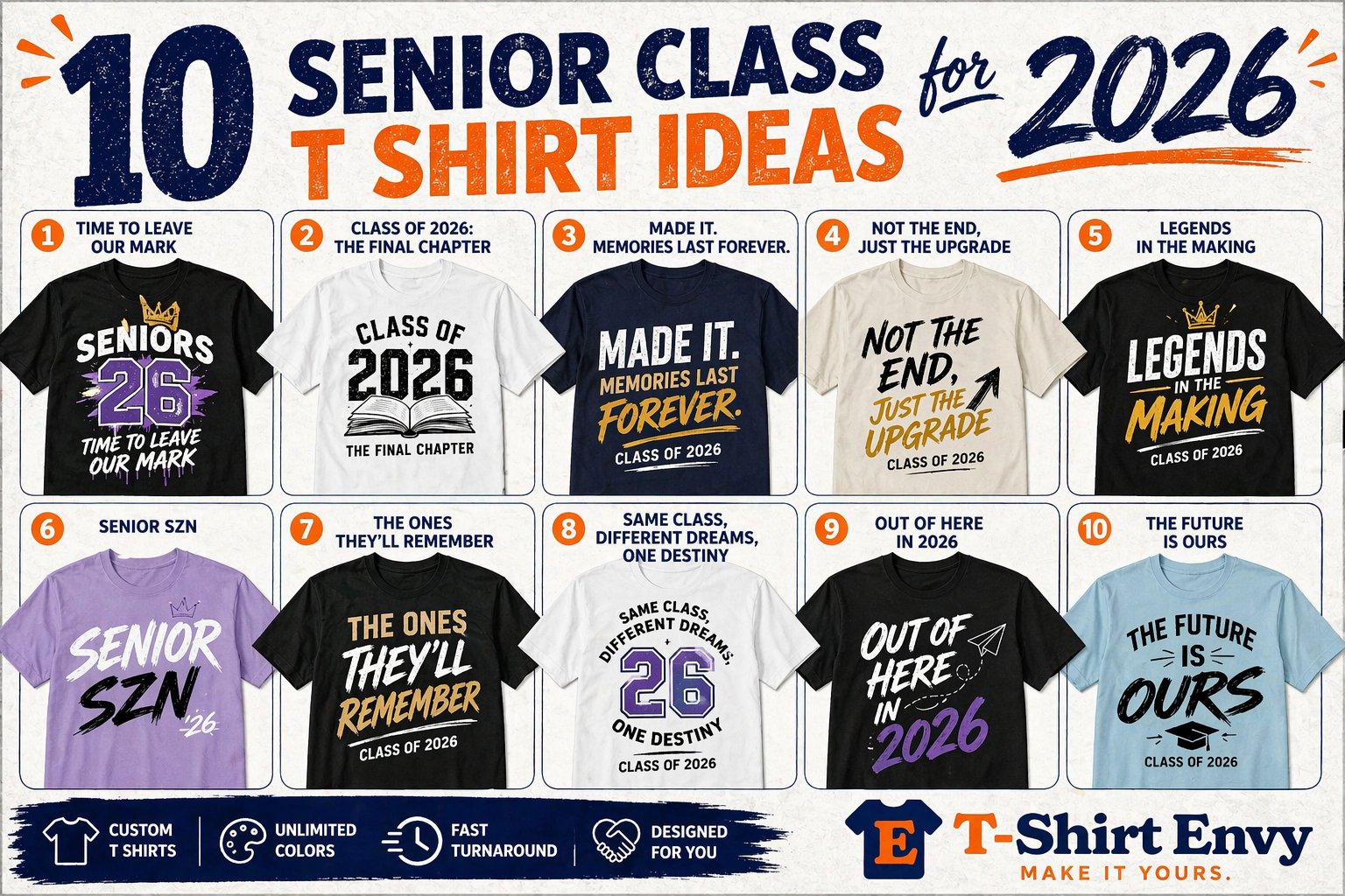
1. Class Year and School Name with Gradient or Ombre Background
This one stays popular for a reason. A bold “Class of 2026” paired with your school name gives you instant recognition, and the gradient or ombre background keeps it from looking like a stock template. It feels modern without risking a design that gets old before senior week.
DTG is usually the smartest print method here. Smooth color transitions are hard to fake with basic bulk printing, and gradients look best when the printer can hold those soft shifts cleanly. If your design has sunset tones, school-color fades, or layered shadows behind the year, DTG is the easiest path to a polished result.
Make the classic look custom
The trick is keeping the year huge and the supporting text restrained. Too many committees try to make the school name, mascot, slogan, city, and club references all compete on the front. That kills the impact.
A better setup is simple:
- Lead with the year: Make “2026” the hero element.
- Anchor with the school name: Put it above or below in a cleaner font.
- Use real school colors carefully: A gradient should support the text, not fight it.
- Personalize the back if needed: Initials, names, or a short class phrase add value without cluttering the front.
Practical rule: Always test the gradient against the actual shirt color before approving the full run. A fade that looks sharp on white can disappear on heather gray or cream.
This style also pairs well with soft retail-fit tees, because the design already feels more fashion-forward than a traditional pep rally shirt. If your committee is debating garment feel, fabric choice matters as much as artwork. T-Shirt Envy’s guide to the best fabric for t-shirts is worth reviewing before you lock in the blank.
For schools that need a proof fast, this is also one of the easiest designs to turn around quickly. The layout is clean, the message is obvious, and revisions tend to be minor. If you’re trying to get signoff in a hurry, start here.
2. Superlatives and Senior Jokes with Humorous Icons
If your class personality is loud, playful, and a little chaotic, humor wins. A shirt built around superlatives, inside jokes, and simple icons feels more personal than a generic graduation design. It also gets better buy-in from students who don’t care about formal school branding.
This concept works best when the humor is broad enough that the whole class can enjoy it. Think “Most Likely to Be Late but Still Graduate,” “Senioritis Survivor,” or major-friendly jokes for college groups. Keep it celebratory, not divisive.
How to keep a funny shirt from becoming a mess
DTF is a strong fit for this style because it handles colorful icons, layered text treatments, and small illustrated details well. If you want mini graphics like coffee cups, caps, alarm clocks, or mascot doodles, DTF gives you flexibility without flattening everything into one blocky look.
Use a quick selection process so the shirt doesn’t get stuck in committee forever:
- Pick a limited set of superlatives: Too many jokes weakens all of them.
- Get admin approval early: Humor that feels harmless to students can still get flagged.
- Match icons to the joke: A visual cue helps the line read faster.
- Choose one font family with variations: Mixed novelty fonts usually look amateur.
A good real-world approach is using the front for one big joke and the back for a grid of smaller superlatives. That keeps the shirt wearable. Students are much more likely to rewear a funny design if the front still looks clean from a distance.
The biggest mistake here is trying to include every joke submitted in the class group chat. The best shirts have editing. If it can’t be understood in a few seconds, cut it.
3. Minimalist Line Art with School Crest or Logo

Not every senior class wants a loud shirt. Some groups want something they can still wear after graduation without feeling like they’re in costume. That’s where minimalist line art works.
A simplified crest, mascot outline, school building silhouette, or clean monogram can turn the shirt into something closer to branded campus apparel. It feels more refined, and parents, faculty, and alumni often like it too.
Why screen printing usually wins here
When the artwork is one color or a limited palette, screen printing is often the cleanest option for larger class runs. It gives crisp edges, strong contrast, and a timeless look that fits the minimalist style. If you’re ordering for a bigger class and the design doesn’t rely on photo detail or heavy gradients, this route makes sense.
Keep the art controlled:
- Stay within a tight palette: Two or three ink colors are usually enough.
- Refine the crest before printing: Small details that look great on a laptop can vanish on fabric.
- Test it on multiple shirt colors: Minimal art lives or dies on contrast.
- Consider a premium variation: The same crest can move to embroidery on polos, quarter-zips, or jackets.
A minimalist shirt succeeds when it feels intentional, not empty.
This approach is especially strong for private schools, academies, magnet programs, and college departments that want a less playful tone. It also holds up well if your class wants a senior shirt that can double as event staff apparel for grad week, signing day, or recognition ceremonies.
The weak version of this concept is a low-resolution crest dropped on a shirt with no cleanup. If you’re going minimal, every line matters. Spend the time to redraw the artwork properly.
4. Photo Collage with Senior Memories and Candid Shots

The week before the order closes, someone always asks to add ten more photos. That is usually the moment a strong collage shirt starts falling apart. The shirts that work keep the image count tight, choose photos with clear faces and strong contrast, and build the layout around one shared story of the class.
Photo collage designs reward good editing. A pep rally shot, a sideline celebration, a backstage candid, and one clean group photo usually say more than twenty scattered snapshots. If the class wants the shirt to feel collectible instead of cluttered, treat it like a mini yearbook cover, not a camera roll export.
DTG is usually the best print method here because it handles skin tones, shadows, and mixed photo detail far better than standard spot-color screen printing. DTF can work for smaller runs or rush jobs if the artwork is already flattened and color-managed, but it tends to look better with bolder photos and less subtle shading. For a large senior order, the trade-off is simple. DTG gives you the photo quality this concept needs, but the file prep has to be cleaner.
Set up the collage before you collect photos
Start with the layout first. Pick a format such as Polaroid frames, a scrapbook cluster, a clean grid, or one hero image with supporting shots. Once that structure is locked, the committee can request the right number of photos instead of sorting through hundreds that will never fit.
Use practical submission rules:
- Ask for original files only: Screenshots from Instagram or Snapchat usually print soft.
- Set a hard image cap: Six to ten photos is a strong range for most front prints.
- Choose one focal image: Every collage needs an anchor.
- Reserve space for class text: “Class of 2026” and the school name should read from a few feet away.
- Run a proof on the actual garment color: Beige, ash, and athletic heather can shift how photos read.
Transfer Express makes the same point in a different context. In their article on class list templates, their standard 11-inch class list setup fits about 106 names before text becomes unprintable. Photo collage shirts hit a similar limit. Once too many elements compete inside one print area, faces shrink, contrast drops, and the design loses impact.
Execution matters more here than in almost any other senior shirt idea. If you are using T-Shirt Envy, collect photos early through the mobile app, narrow the finalists with a quick committee vote, and request a proof before the full run goes into production. If the senior deadline is tight, rush printing can save the schedule, but only after the artwork is finalized. Last-minute photo swaps are what slow this style down.
This concept fits smaller classes, senior councils, clubs, theater casts, and teams especially well because the shared memories are more specific. Large classes can still make it work, but the better approach is fewer images, stronger cropping, and sharper art direction. More photos rarely improve the shirt. Better photos do.
5. Senior Countdown or Milestone Timeline Design
A timeline shirt works because it tells the story of the class instead of just labeling the year. Freshman orientation. First big win. Prom season. Last first day. Graduation countdown. When laid out well, it creates nostalgia without needing photos or heavy personalization.
This style is especially good for classes that want a back print. Timelines need horizontal room, and the back gives you enough space to sequence the milestones clearly. The front can stay clean with a chest print or small school mark.
Keep the story readable
The timeline should feel like a graphic system, not a paragraph on cotton. Use short labels, simple icons, and consistent spacing. Four or five major milestones are usually enough to make the idea land.
Try a structure like this:
- Start point: A freshman-year marker or school entry point
- Middle beats: A few shared moments or traditions
- Final marker: Graduation year or event date
- Closing phrase: A short line that ties the journey together
This design works well in either screen print or DTG depending on the complexity. If the visuals are mostly icons and text, screen printing keeps it sharp. If you’re adding textures, layered shading, or color transitions, DTG gives more flexibility.
A strong example is a class that uses mascot icons for each year level. One icon per school year, one short phrase under each, then “Class of 2026” anchoring the end of the line. That gives the shirt movement and keeps it from reading like a bulletin board.
The weak version tries to document every event. Don’t turn the shirt into a calendar. Pick the moments widely recognized and leave the rest out.
6. Custom Mascot Illustration with Dynamic Action Pose

If school pride is the main goal, a custom mascot illustration is hard to beat. A redesigned eagle, tiger, bulldog, knight, or wildcat in motion instantly gives the shirt energy. It feels less like a template and more like a limited-edition release for your class.
Committees should stop using clip art. A custom illustration changes the whole result. The shirt feels intentional, and students treat it like real merch instead of fundraiser leftovers.
Choose the print method based on artwork style
If the mascot has layered shading, strong color transitions, or comic-style detail, DTG or DTF makes sense. Both can carry more visual complexity than a simple spot-color print. If the illustration is flatter and bolder, screen printing may still work, especially for larger runs.
Keep the redesign tied to school identity. A modern mascot should still look like your mascot, not a random sports logo. T-Shirt Envy’s guide on how to design prints for t-shirts is useful when you’re converting a sketch or concept into something printable.
Use a few rules before approving final art:
- Respect existing school branding: Colors and character traits should stay recognizable.
- Pick an active pose: Running, leaping, roaring, pointing, or charging all read well.
- Watch the outline weight: Fine detail can disappear on fabric if the strokes are too thin.
- Mock it up on dark and light shirts: Mascot art often behaves differently across garment colors.
The best mascot shirts look like campus merch students would choose to buy, not just accept.
This concept works especially well for spirit week, senior night, athletic-heavy classes, and schools with a mascot everyone rallies around. It can also extend beyond shirts to hoodies, hats, and jackets if the class wants a fuller senior collection.
7. Personalized Back Print with Individual Names and Graduation Quotes
Distribution day is where this idea succeeds or fails. If students flip the shirt over, find their own name spelled right, and see a quote they chose, the shirt becomes a keepsake. If two backs are swapped or a line breaks badly, the committee hears about it immediately.
That is why personalized back prints need a production plan, not just a design concept.
The front should stay simple. Use the class year, school name, crest, or a small senior mark on the chest. Save the custom detail for the back, where each student gets a name, nickname, short quote, or grad line. If you want more visual direction before locking the layout, review these graduation shirt design ideas.
Match the print method to the level of personalization
For individual names and quotes on each shirt, DTF or DTG usually makes the most sense because variable back prints are easier to manage than a traditional screen setup with constant changes. Screen printing can still work if every shirt shares the same back design or if only a short name list is being handled in a controlled run, but once every garment changes, digital methods are faster to prep and easier to proof accurately.
This is one of those jobs where execution matters more than concept art.
Use a process like this:
- Create one master roster: One spreadsheet, one file owner, one approval deadline.
- Set hard character limits: Long quotes create tiny text or awkward line breaks.
- Lock naming rules early: Full names, preferred names, initials, and nicknames cannot all coexist without causing layout problems.
- Approve back prints separately: Students often approve the front and forget to check the personalized side.
- Group orders before production: Sort by size, homeroom, or pickup batch so distribution stays organized.
T-Shirt Envy can support custom-name orders well, especially when a class needs quick proof revisions or rush printing, but the committee still has to provide clean data. The mobile app helps collect sizes and order details in one place, which cuts down on the usual mess of screenshots, DMs, and duplicate forms.
Template demand for this category is easy to see in the market. IZA Design’s senior class t-shirt page shows a large catalog of senior templates, including Class of 2026 options, and that tells you something practical. Schools order this style every year because personalization has real emotional value. The part that separates a good result from a frustrating one is order handling.
This idea fits smaller senior classes, academies, clubs, and programs where students know each other well enough to appreciate the personal detail. For very large classes, I usually recommend names only or a shortened quote format. Readability drops fast once the back turns into a wall of text.
8. Retro or Vintage-Inspired Design with Throwback Typography
Retro designs work because they already feel like a memory. That makes them perfect for senior apparel. Whether your class leans 70s sunset stripes, 80s athletic lettering, 90s block graphics, or Y2K chrome effects, the nostalgia factor fits the moment.
This is also one of the most wearable concepts after graduation. A good retro shirt looks like streetwear first and school merch second. That’s a huge advantage if you want strong adoption across the class.
Pick the era before you pick the fonts
The biggest mistake is mixing three decades into one design. If you want a throwback look, commit to one visual language. A 70s wave font doesn’t belong next to Y2K metallic stars and 90s grunge textures unless you have a very skilled designer controlling the blend.
For production, the print method depends on the execution. Distressed one-color collegiate art can look great in screen print. Multicolor retro fades, texture overlays, and detailed effects usually lean DTG.
Good retro direction choices include:
- Varsity revival: Clean athletic fonts and old-school school pride layouts
- Sunset stripe look: Warm bands of color behind the class year
- Y2K style: Glossy, futuristic text with playful icon accents
- Washed campus tee aesthetic: Muted print on garment-dyed blanks
This concept works especially well for schools that want the shirt to feel trend-aware without relying on jokes. It’s also a smart compromise when the class is split between “make it cool” and “make it traditional.” You can do both with the right era reference.
The key is restraint. Vintage-inspired should feel curated, not costume-like.
9. Charity or Cause-Driven Design with Purpose Message
Sometimes the best senior shirt isn’t only about the class. It’s about what the class stands behind. A cause-driven design can support a local charity, community need, scholarship effort, or awareness campaign while still functioning as senior apparel.
This route works well when your school already has a service culture. National Honor Society groups, student government, service clubs, and faith-based schools often get strong support for a shirt that carries purpose. It gives buyers another reason to say yes.
Handle the message and logistics professionally
The design should clearly connect the class identity to the cause. Don’t bury the mission in small text. If the class is supporting a recognized organization or local need, state that cleanly and make the design feel unified instead of patched together.
A practical setup includes:
- Choose a legitimate partner: Use an established charity or school-approved initiative.
- Get approval in writing: Donation terms should be documented before sales begin.
- Build the message into the art: Don’t make the cause feel like an afterthought.
- Report the outcome to buyers: Students and families want to know the effort mattered.
The strongest version of this concept uses thoughtful design, not guilt-driven messaging. A shirt can still be stylish, school-centered, and purpose-led at the same time.
This can also extend your selling window. Students who may not normally buy class apparel sometimes support a shirt when there’s a community component attached. The only caution is making sure the class leadership is transparent about where the funds are going and how the campaign is structured.
10. QR Code Integration with Digital Content Portal
This is the most modern option on the list, and when it’s done right, it’s one of the smartest. A QR code on the shirt can link to a digital portal with senior photos, class videos, playlists, memory submissions, messages from faculty, or a simple graduation landing page.
It turns the shirt into more than a print piece. It becomes an access point.
The code has to scan every time
This isn’t a design gimmick. If the code doesn’t scan instantly, the idea fails. That means the code needs enough contrast, enough print size, and enough breathing room around it. DTG is often the safest method here because it can reproduce the code sharply when the file is prepared correctly.
Use direct instructions so people know what to do:
- Add a short prompt: “Scan for Senior Memories” works better than a random square.
- Link to a mobile-friendly page: Most users will scan from phones.
- Test the code on the actual shirt color: Contrast matters.
- Keep the destination simple: One clean landing page beats a cluttered menu.
A strong real-world version is a left-chest front graphic with the QR code placed on the sleeve or lower back, plus a clean destination page with class photos and video clips. That keeps the shirt stylish while preserving functionality.
This concept is especially good for tech-oriented schools, media programs, senior committees that already manage social content, and classes that want a hybrid keepsake. Just remember that digital content still needs curation. A QR shirt with a sloppy landing page feels unfinished.
Top 10 Senior Class T-Shirt Design Comparison
| Design Option | 🔄 Implementation Complexity | ⚡ Resource Requirements | 📊 Expected Outcomes / Impact | 💡 Ideal Use Cases | ⭐ Key Advantages |
|---|---|---|---|---|---|
| Class Year & School Name with Gradient or Ombre Background | Moderate, DTG setup and color testing | DTG printer, color-accurate garments, proofs | Professional, high-visibility, timeless appeal | Large orders prioritizing class unity and school pride | Elegant visual depth; versatile and customizable |
| Superlatives and Senior Jokes with Humorous Icons | High, content curation and vetting required | DTF for multi-color detail, creative time, approvals | Memorable, highly shareable, strong engagement | Classes seeking personalized, social-media-friendly keepsakes | High emotional connection; playful personalization |
| Minimalist Line Art with School Crest or Logo | Low, simple file prep for screen print | Screen printing, skilled line-artist (1–3 colors) | Timeless, durable, versatile across garments | Groups preferring understated, sophisticated apparel | Cost-effective at scale; easy to embroider; classic look |
| Photo Collage with Senior Memories and Candid Shots | High, photo collection, layout, and rights management | DTG, high-res images, extensive editing time | Highly personal keepsake with strong sentimental value | Classes wanting memory-rich, photo-based shirts | Unique photorealism; strong emotional resonance |
| Senior Countdown or Milestone Timeline Design | Moderate, requires clear planning and layout | DTG/DTF, iconography, coordination of events | Narrative-driven unity and nostalgia | Classes emphasizing shared journey and milestones | Cohesive storytelling; flexible for multi-color printing |
| Custom Mascot Illustration with Dynamic Action Pose | High, custom art and revisions needed | DTG/DTF, professional illustrator, high-res artwork | Bold identity and elevated perceived value | Classes wanting strong school-spirit, standout designs | Visually striking; reusable with minor updates |
| Personalized Back Print with Individual Names and Graduation Quotes | High, complex order management and QA | Screen printing/back-print workflow, tracking system | High individual value; supports premium pricing | Teams and classes seeking individualized keepsakes | Deep personalization; collectible appeal; scalable per-unit |
| Retro or Vintage-Inspired Design with Throwback Typography | Moderate, era-accurate styling and textures | DTG or screen printing, experienced designer | Trendy, distinctive aesthetic with social appeal | Fashion-conscious classes seeking unique identity | Distinctive nostalgia; high shareability |
| Charity or Cause-Driven Design with Purpose Message | Moderate, requires charity coordination and transparency | DTG, partner agreements, donation tracking logistics | Positive PR, broader participation, fundraising impact | Socially conscious classes aiming for community impact | Purpose-driven sales; strengthens community relations |
| QR Code Integration with Digital Content Portal | High, tech integration and portal maintenance | DTG/DTF for crisp codes, web dev, ongoing updates | Extended engagement, analytics, dynamic content | Tech-forward classes wanting hybrid physical+digital | Innovative, updatable experience; measurable engagement |
From Idea to Iconic Your Senior Shirt Action Plan
The usual senior shirt failure looks the same every spring. The class picks a design everyone half-likes, revisions drag on for a week, sizes trickle in one by one, and the order gets approved right before the deadline. At that point, the committee is no longer choosing the best shirt. It is choosing what can still be produced on time.
A better process starts with production, not just taste. Pick the design direction first, then match it to the print method before anyone adds effects that only work on a screen mockup. Gradient class-year graphics usually call for DTG or DTF. Big spirit designs with solid colors often make more sense in screen printing. Personalized backs need a clean roster and strict proofing. Photo collages rise or fall on image quality, so low-resolution screenshots should be rejected early.
That print-method decision affects cost, speed, and error rate. I usually tell school committees to treat the art file, garment color, and print method as one package. A minimalist crest on a heavyweight tee can look more premium than a crowded full-front design, but only if the line weight is clean and the ink color has enough contrast. A custom mascot can become the shirt everyone keeps wearing after graduation, but only if the illustrator delivers print-ready vector art instead of a rough social-post graphic.
T-Shirt Envy gives committees more room to make those choices correctly because it offers DTG, DTF, screen printing, embroidery, and sublimation. That matters in practice. A class can run photo-heavy fronts through DTG, use screen printing for a large spirit order that needs strong color and repeatability, or add embroidery when the goal is a cleaner, more upscale finish. The design does not have to be forced into one production method just because that is the only option on the table.
Order management is where senior projects usually slip. One person should own approvals. One file should be treated as the final art file. One spreadsheet should control names, sizes, and quantities. If three people are texting edits and another volunteer is collecting size notes in a separate doc, mistakes show up fast.
The TSE mobile app helps tighten that workflow. Committees can upload artwork, check order status, and manage details without digging through long email threads between class, home, and adviser meetings. For school groups, that is not a nice extra. It is how you keep a rush order from turning into a reprint.
Late ordering is common with senior apparel, and even general industry coverage aimed at school groups points to that pattern in practice (Ooshirts senior shirt ideas overview). That is why turnaround options need to be discussed before the committee falls in love with a complicated design. If approval stalls for a week, the answer should not be “simplify the shirt until nobody cares about it.” The better answer is to choose a shop that can still hit the date.
T-Shirt Envy offers same-day, 24-hour, and 1-hour service options for time-sensitive orders. That gives committees a workable backup plan when admin approval lands late, the final roster changes, or the event date is fixed and cannot move. Speed only helps if print quality holds up, so the smart move is still to finalize files early and use rush service as protection, not as the whole strategy.
Senior shirts also deserve more respect than they usually get. This is a real annual purchase for schools, and students judge it like any other piece of apparel. If the shirt feels cheap, fits poorly, or looks cluttered, they stop wearing it. If the committee builds the project carefully, the shirt becomes part spirit wear, part keepsake, and part class identity.
Use this sequence. Run a quick class poll. Cut the choices to two concepts. Build a professional mockup before the committee edits the design into a mess. Confirm the print method, garment, and ink approach at the same time. Then collect sizes, lock the roster, approve one final proof, and submit the order in a single controlled batch.
Your class gets one shot at the senior shirt. Make it readable from a distance, comfortable enough to wear after graduation, and organized well enough to arrive on schedule.
Start your order with T-Shirt Envy and turn your senior idea into a print-ready class shirt fast. Download the TSE mobile app to upload artwork, manage your group order, and keep production moving with the speed your graduation calendar demands.


